Showing posts with label Distress Ink. Show all posts

Thursday, April 12, 2012

Rogue Redhead: Chemistry Lesson

It's Rogue Redhead Thursday!

It's no secret that I love Tim Holtz's techniques! And like many of you, I enrolled in Chemistry 101 for a few lessons. I haven't completed all the classes just yet. But one or two of the techniques inspired me to get out BITS and PIECES and FLORICULTURE.

This first tag is "Spritz and Flick". Sponged color and drops of water. I used Broken China, Scattered Straw, Rusty Hinge, Spiced Marmalade, and Brushed Corduroy.


This second tag was a "WOW" gotta try that technique. Tim calls it "Archival Resist". I used Archival Sap Green, Olive, Monarch Orange, and Saffron. Tim sponged his creation with a brown Distress Ink and I thought it looked dull and lifeless.  So I used Scattered Straw and a little Spiced Marmalade.

Thursday, January 12, 2012

Rogue Redhead: Je T'aime

It's the first even Thursday of the new year! Time for some Rogue Redhead goodness!

It seems like FOREVER since I did any tags....and then I had to stop and laugh. I did all 12 days of Tim tags...silly me! Still the urge to do a tag over took me tonight.

The background text and boy come from RELISH READING and the sentiment is part of FLORICULTURE. I tucked a heart under his arm in preparation for Valentine's day!

Stamps: Rogue Redhead Designs RELISH READING & FLORICULTURE (sentiment)
Ink: Archival Jet Black, Distress Inks
Paper: tag
Accessories: ribbon/rhinestones; Prima rose & butterfly, copper spray, heart Nestabilities

Friday, December 9, 2011

Tim Tag 2011 - Day 8

Ok...I didn't get my tag done yesterday. I got home and fell asleep during dinner. I needed a night off!

I really liked Tim's Steampunk tag...but it didn't say "Christmas" to me. So I used the same background technique (love arcylic resist) and collaged a postcard to Santa!The Distress Inks I used are Tim's new holiday collection (Festive Berries, Evergreen Bough, Iced Spruce - LOVE THEM!!). I also sprayed the background with Marshmallow Glimmer Misty - it adds a snowy white sparkle. Santa was stamped with Festive Berries then clear embossed and also sponged with Festive Berries.

The lights I colored with Red Pepper alcohol ink. I had the idea and then saw that Ellen Huston's Classroom also had the same idea (she used Copics). Great minds!!

I'm off to get some dinner, then work on Tag #9...

Wednesday, December 7, 2011

Tim Tag 2011 - Day 7

Whew! I'm so relieved that Tim is back on his game today! I LOVE THIS TAG!!!

I changed a few things up. I used my favorite technique for the background - the "spray and smoosh". Tim calls it Wrinkle-free distress. I stamped swirls and red postmarks in the background for interest.

I've been waiting all year for him to demonstrate uses for the kraft glassine paper. I'm really inspired and can't wait to play with more of the techniques in his video.

The sentiment is one of my favorite Amuse Studio sets - Vintage Holiday Greetings. If you're interested in ordering contact Chris.

Ready for Day 8!

Thursday, June 2, 2011

Rogue Redhead Designs: BITS & PIECES

As I noted at the end of the post yesterday - I was invited to join the ROGUE REDHEADS design team! This card was created using the BITS AND PIECES plate!

Please visit the Rogue Redhead blog to find out how I did this card!

Saturday, April 23, 2011

Tag Tuesday - EASTER

The Easter bunny came early to my house...and left me a carrot!

Or at least that's what I tried it make it look like.

* Carrot clipart from Oxford Impressions. I couldn't find that one in her collage sheets so maybe she's not selling that one anymore.
* Bunny inches/clipart from Etsy - Sainesydney

Stamps: none
Paper: tag, green scrap, black c/s
Ink: Distress Ink: Orange Marmalade; Wild Honey; Vintage Photo
Accessories: clipart, green yarn, Martha Stewart tulip boarder punch, white lace, Orange Peel Stickles, Glimmer Mist: Pearl

Wednesday, January 5, 2011

Gingersnap Creations: HOT BEVERAGES


Once Christmas is over I immediately start "craving" Spring colors - blue skies and green leaves! I have to confess I don't drink many HOT beverages... I'm a Diet Coke girl thru and thru! It's my coffee in the morning and my glass of wine with dinner. But this cup from Flourishes was a must for my hot beverage. The cup was stamped on a scrap of Memory Box paper that changed pattern along one edge. You can see the polka dots on the cup and circles on the saucer. I just sponged a bit of Broken China on the cup to give it additional dimension.

The tag background is a variation on the classic "smoosh & spray" technique (color pads rubbed on a craft sheet and misted with water). I sponged color on the tag first. Then I sprayed water on my craft sheet to make the colors "run" a bit. My "new" favorite coffee ring stamp. And then embellishment.

Stamps: Flourishes COFFEE WITH FRIENDS; Hero Arts GIRLFRIEND (sentiment); Stamper's Anonymous COFFEE RINGS
Paper: Tag
Ink: Distress Ink - Broken China & Shabby Shutters
Accessories: White embossing powder, doily, Prima flowers, pearls, ticket & leaf punch, Stickles, trinket pin, ribbon

If you'd like to play along with the Gingers, you have a MONTH to post your interpretation of HOT BEVERAGES on the Gingersnap Creations post. Be sure to stop by here and leave me a link to your creation too!

Have fun - stay warm - see you next week!

Saturday, December 4, 2010

Tim's 12 Tags of Christmas - tag #2

This is my take on Tim's Day #2 tag. You'll note that my tag looks NOTHING like Tim's. LOL...but that's ok. It was the technique of creating your ink pad that was at the heart of Tim's tag.

I used my FAVORITE Stamper's Anonymous Santa image for this. There's just something about that classic face with the "giggle mitten".

Since this is a large image I stamped it out on white first (upper left) and then used sponges to color in the areas. That gave me a feel for how to color the ink pad (center bottom). The test image from the ink was very bright but I needed more ink (center top). Finally the "final" image was stamped on the tag.

The tag was finished in a similar manner to Tim's (inked, covered with clear embossing powder, sponged color, etc). I finished with a small strip of musical paper at the bottom (also sponged with Fired Brick & Vintage Photo). Accented with a RED LEAD holly spring, red silk ribbon, and at the top - red net ribbon and silver mini tinsel.

And yes...there are multiple tags here. Since this was an ink pad - I decided to do some tags for future use (MORE ON THAT NEXT WEEK).

Tim's 12 Tags of Christmas - tag #1

I intended to post this last night but I had technical difficulties (my camera battery was dead!!)

I love the first of December when Tim Holtz starts posting his 12 Tags of Christmas. For one thing I always learn SOMETHING new! Second, Tim posts a lot about where he's teaching but rarely posts any of his work anymore. And third...his work is just AMAZING!! If you missed Tim's #1 tag look HERE.

So here's my tag. How does it differ from Tim's? Well for one I don't have the wonky house die Tim used. But I did have the embossing folder. So I cut GrungeBoard "chunks" out in a "bird house" shape. You know - a rectangle and triangle roof. I followed most of his steps for coloring and adding "snow". I used the same glass glitter that I use on my Crystal Snowflakes. And a branch I pulled off my mom's aspen tree (sorry mom!)

The background is pure Spray and Smooth - Distress Ink on a Teflon mat, misted with water, and smooshed. For a little shine I finished by spraying Glimmer Mist SNOW QUEEN.

I didn't have Tim's fence die, but I did buy Martha's Large Halloween fence. I just cut the bats off and it's a regular fence! I stuffed a little reindeer moss (I swear that's the name on the package). I didn't use Tim's technique for creating the ticket. I just stamped with Archival Coffee and sponged color on.

I tried dyeing my ribbon the same way Tim did but I just ended up with a blue ribbon (no color variations) and blue fingers! I added a small rusty snowflake charm to the ribbon.

I will be posting my other Tim tags today - and a BIRTHDAY GREETING for my niece JESSICA. So come back thru the day!!

Thursday, December 2, 2010

Thank You

So after all the great gifts I got at the surprise party...I needed thank you cards! Like the tag I posted on Monday, my inspiration for the colors came from Shari Carroll's blog posting. In fact, she used the digi version of the stamp (which I've had for ages but never inked up!)

I used Basic Grey AMBROSIA paper. It use that same great color combo of reds, oranges, and grays.

This is also Basic Grey AMBROSIA.

The color mix was just sponged Distress Inks (Fired Brick, Wild Honey, Pumice Stone) on white paper. Then I stamped over the random color blogs with Archival Black. The birds and sentiment (Stampin' Up!) were stamped, cut out, (inked in the case of the birds), and popped up with foam dots.

Monday, November 29, 2010

The Dirty Craft Room!

Nobody ever accused me of being a great housekeeper. There are TONS of better things to do than dust and vacuum. I always shake my head when my niece and mother say they LIKE to clean!!! UGH!!

So here's the DIRTY craft room/office/guest room. I got home from New Jersey and rolled the suitcase in to unpack and it sat there! In addition, every flat service was covered with something from prepping for class. Needless to say stamping was out!


But I did get most it cleaned up. Enough that I had stamping space again! And so here's my VOW!

I promise to post every day in December to this blog!!

If you're a fan of Ali Edward's you know she's been prepping for her December Daily posts. I did that last year (and I will share that tomorrow). This year, I decided to do an "electronic" version! :D

To get my MOJO flowing I did this quick tag last night (I was working on some thank you cards). I saw this post by Shari Carroll last week and love her colors (Distress Ink: Fired Brick, Wild Honey, and Pumice Stone). I paired those colors with Memory Box stamps and some Basic Grey scraps (from the thank you cards).

And I will leave you with this bit of goodness:


Gotta LOVE Tim's ego...LOL! I can't wait to work on my tags with Tim!!

See ya tomorrow!

Sunday, October 31, 2010

HAPPY HALLOWEEN!

Happy Halloween!!

Life is slowly getting back to "normal". I just finished my first month back at work and that's going well. Last weekend I taught my classes at ONE LITTLE SPARK in Tuckerton, New Jersey. A big thank you to Pat, Lee, Heather, and the ladies in the class!! I had a UBER WONDERFUL TIME!!!

Here are the tags we did in class! Hope you have a Happy Halloween!! (OH....and I became a GREAT AUNT DEB last Friday!!!! (yes, I was always "great" but now it's official!!)


Be safe tonight!!

Wednesday, October 6, 2010

Howl at the Moon! Class preview

I can't believe it's a little more than two weeks before I head over to New Jersey to teach my "grungy tags" at ONE LITTLE SPARK!! I'll be taking Heather and Sue's classes on the 23rd (I can't wait). And here's another sneak peek at my classes!

A Distressingly Good Time - An introduction to all the wonderful things you can do with Ranger Distress Inks. We’ll be creating some fabulous spooky tags that you can add to a card, use on a gift, for scrapbook embellishments, or keep them as handy reference. Join Deb and get your grunge on!


A Ghastly Glimmer - Do you love the look of Glimmer Mist, but are stumped on how to use it? Join Deb, as she teaches you the tricks of the trade - both on it's own AND paired with other products to a ghastly, glimmery effect! You'll go home with tags you can use on a card, as a scrapbook embellishment, or keep them as handy reference!

Monday, August 16, 2010

With Deepest Sympathy

A friend lost her father this last week. I don't keep sympathy cards on hand. Many months ago I had seen this tutorial by Jennifer McGuire, and this is pretty much a CASE from the stand point of the coloring and card shape. But I did do somethings differently.
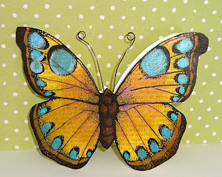
I had never used a digi print before. Jennifer's video goes into great detail about how to buy, download, and use the digi print, so I won't cover it.
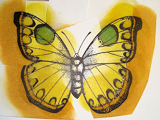
I started by cutting out a mask of the areas I wanted to keep the color from. Then I sponged Mustard Seed along the outer wing edges.
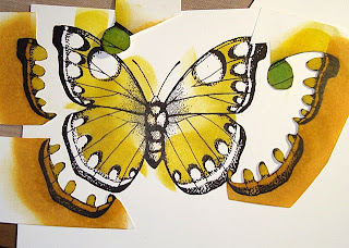
After removing the masks you can see that the wing tips and spots are still white.

Then I sponged Wild Honey in the center and used Jennifer's method for the wing tips (flat piece of scrap paper as a mask).

Then I used the other part of the mask that had the spots cut out and sponged blue from the center out; being very careful not to cross the line (you can still see a bit of white).

The larger spots I sponged directly with a twisting motion.
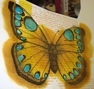
Then like Jennifer, I stamped the "FRIENDS DEFINITION" over the entire area. I selected a Twinkling H2O that matched the Broken China blue and painted circles around the edges. You can see it's still wet in the upper left.
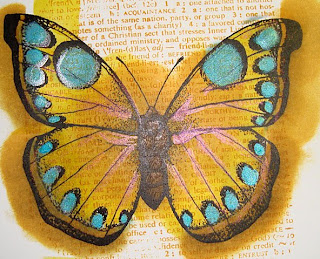
And a coppery color along the wing veins. Once dry you get a glimmer. The body was colored a darker brown with a Copic marker. Then I cut out two single butterfly shapes and adhered them together. One I wanted to cover any color that might have gotten on the back of the colored butterfly. And two, I wanted the butterfly shape to have a little more strength. Stampin Up! Whisper White is a great card stock for sponging (there's no tooth to it so the color flows), but it's not very sturdy.

I cut more card stock 4.25" x 11" and scored it, like a normal card. I off set the colored butterfly just a bit, so there would be a fold along the wing edge.
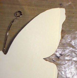
I made antennae out of wire and placed it between the colored butterfly and the card.

Stamps: Hero Arts digi-print & FRIENDS DEFINITION
Paper: Stampin Up! Whisper White
Ink: Distress Ink
Accessories: wire, Twinkling H2O's

Monday, August 9, 2010

Faux Designer Paper Thank You

So after being hosted by a bunch of GREAT people on my vacation - I have a bunch of thank you notes to send!!
This is a combination of Technique Junkies methods: Faux Designer Paper (which is one of my favorites) and Torn Frames. I used a combo of Distressed Inks for the background paper and the main image. I highlighted the palm tree with white gel pen and my favorite glitter pen (adds shine but not color).

Stamps: Stamping Up! BALMY BREEZES
Paper: kraft, Ruby Red, White
Ink: Archival Coffee & Distress Ink
Accessories: Clear EP, twine, red eyelets, white highlight pen, glitter pen, sponges
Technique Junkies: Faux Designer Paper & TornFrames

Friday, June 25, 2010

Tag Tuesday #57 - POSTAGE

Louise's challenge for TAG TUESDAY this week is POSTAGE! My "postage" is a sticker from a new set by K & Company.
I found the tag background in my pile of 'created but not used'. It was a watercolor smoosh background, but the tag was paper (not manila tag). So the water soaked thru and didn't mix well. And it warped the paper badly. But I stamped the STAMPENDOUS rose stamp over and highlighted by sponging with distress inks. I used a white gel pen to add some brightness.

Even after mounting this tag on a card stock mat - this paper tag is still warped. I think that's why the background was in the 'created but not used' pile.

Wednesday, June 23, 2010

GC60: Shades of Blue

This month's color challenge at Gingersnap Creations is SHADES OF BLUE.

The tall lady is colored with Copics. The "stylish" ad is China Blue sponged on white and then the image was stamped with Chipped Sapphire.

Stamps: Hero Arts SEW STYLISH & SMART STYLE; Memory Box SONOMA PRINT
Paper: Memory Box JUBILEE
Ink: Distress Ink
Accessories: Prima flower, silver ball rhinestones, ribbon, EK Success punches

Saturday, June 19, 2010

Hanglar & Stanglar - Shabby ChicK

I love Hanglar and Stanglar but they are not for sell here in the US (more's the pity).

BUT I do have a Norwegian connection and some times she'll send me a few. I'm not entirely sure of the Swedish/English translation (it doesn't read like Norwegian) but I think the title of this stamp is 'GIRL WITH A HEN'.

There's a new Hanglar & Stanglar challenge blog and round #2 was for a SHABBY CHIC card.

So I got out some of my hew Tim Holtz stuff (paper, die cut edge, stick pin, ticket) and did a "grungy" card. The image was watercolored with Distress Ink and my aqua pen. The sunflowers were cream and heavily sprayed with SUNFLOWER Glimmer Mist (I *LOVE* that color). I' m not sure you can see the brown swirl under all the flowers and stuff - but I cut that with my Slice. (I'm trying to learn to love my Slice...). And for some extra "glitter" I used the clear dots. I don't think they make them any more (too bad) but they're flatter than the Dew Drops and add some sparkle. As I was editing the picture I thought I should have inked the edges of the background paper for more distressing - guess she's a "clean" shabby chic!

Stamps: Hanglar & Stanglar & Hero Arts FRIENDS DEFINITION
Paper: Tim Holtz
Ink: Distress Ink
Accessories: Tim Holtz edge die, prima flowers, Glimmer Mist, buttons, Scrapper's Floss, Slice, stick pin, glitter pen, aqua painter, ticket, scalloped Nestie.

Did you catch the "K" I added to Chic in the title? (grin).

CoC #1 - Water-stamped Tulips

Linda Ledbetter over at Studio L3 has challenged the owners of Tim Holtz's new book A COMPENDIUM OF CURIOSITIES to use the techniques found between the pages. The first challenge is Water-Stamping (pg35).

I rubbed and sponged the background with Distress Ink. Then used the Hero Arts tulip to do the water-stamping. But instead of just leaving the water-stamped tulips as the focal point - I made it the shadow background to the main image tulip.

Stamps: Hero Arts ANTIQUE ENGRAVINGS; Memory Box TENDRIL PRINT
Paper: tag
Ink: Distress Ink: Spun Sugar, Worn Lipstick, Peeled Paint, and Shabby Shutters
Accessories: ribbon, button, Scraper's Floss, rhinestone

Wednesday, June 16, 2010

Didn't Publish

My friend, Heather, convinced me to submit these cards to Paper Crafts STAMPING ROYALTY contest. I had my doubts, but did it. I love Paper Crafts magazine but they really aren't my style of cards. As I expected none of these made the cut (grin).

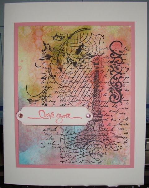
LOVE - this was a Distress Ink background - smoosh 'n' spray. The stamp is a Christmas stamp but other than a bit of holly on the spray and the sentiment it's great stamp. The sentiment was Stampin Up! I used a small sponge to highlight areas of the image

Stamps: Penny Black CHRISTMAS IN PARIS; Stampin Up! SHORT AND SWEET
Paper: Pink & white card stock
Ink: Distress Ink
Accessories: Nesties & rhinestones

HELLO/THINKING OF YOU - the image was colored with Copics and cut out. The rest is just that great Basic Grey ORIGINS paper.

Stamps: Stampendous SCENIC SUNFLOWER
Paper: Basic Grey
Ink: Memento
Accessories: Nesties, rhinestones, Copics

THANK YOU - Stamped the bamboo image on plain card stock. Then layered the HAIKU paper. The doll image was colored with Copics.

Stamps: Hero Arts FOUR DOLLS and ASIAN FRAMES
Paper: Stampin Up! HAIKU
Ink: Memento and VersaColor BAMBOO
Accessories: flower, Copics, pearls, border punch

CHRISTMAS - I love this Santa! It's such an iconic image. I stamped with Distressed Ink and no other color.

Stamps: Rubber Stampede SANTA COLLAGE
Paper: Graphic 45
Ink: Distress Ink
Accessories: Prima flower, Martha Stewart punches, ribbon