
Stamp by Lost Coast Designs

 I started with a kraft card and stamped the background of the Beach Babes set in blue. Then I picked two designer papers from Memory Box's VALISE collection and backed them in blue. The image is stamped on kraft and lightly water colored. The final touch was my white souffle pen to give the shirt some definition.
 I'm not a watercolor artist (as you can tell), but awhile back I took a class from Dave Brethauer from Memory Box Stamps. Dave taught us the basics of water-coloring with Twinkling H2O's. Creating beautiful backgrounds is pretty easy.
 I have tons of H2O's but recently I purchased this tray of opalescent watercolors from Red Lead Paperworks. I like the vintage colors. They aren't as bright as H2Os.
 After the color dried I decided there wasn't a horizon line. I'm not sure you can tell in this picture, but I used my white Souffle pen and some glass glitter create the look of foamy water hitting the beach.
 Here's the first background made on a thin Japanese paper. It's like tissue paper but a bit thicker.
 Here's the card from that background.
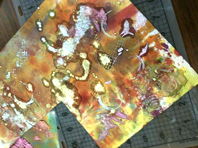 This is the other Japanese paper background. The H2O's I was using were not "flinging" in a droplet manner but in big blotches. I thought I had "ruined" the paper but as you can see below, it turned out ok!
 I think this is my favorite - but in the class it's like trying to pick between your favorite kids. I love them all equally! Then we turned to another paper...
 ... to 90 lbs. watercolor paper. This time the paper wasn't saturated with color and is more subtle. We also didn't use the H2O's.
 The class handouts included a set of "masks" to cut out for a positive/negative image. These "masks" are available on Fred's website in PDF format. I picked the petroglyph horse. The background of this card is the paper above. The horse was cut from the right half of the piece below.
 The 2nd sheet of 90 lbs. watercolor paper.
 I also used the negative image of the petroglyph horse and a piece of the Japanese paper to back the image.
 Both watercolor papers also had backs - the "wiped up" mist left from the other side of the paper. I do this often with glimmer mist - it makes the best backgrounds!
 I still have LOTS and LOTS of paper left. I can't wait to continue playing with the left over scraps (and make some more)!!!
 I thought long and hard about the ink to use and ended up with Archival because it wouldn't run when wet. But for coloring I was stumped. I thought anything I used would follow the grain under the "image" edge. I stamped the main image, stamped a smaller section on a scrap and then the very center. I will say this wood paper does cut nicely! Since there were printed scraps I played with those. I tried COPICS first and that did run. It looked like a blurry mess. Then I tried a very "dry" aqua pen and Distress Inks. As long as the brush tip wasn't too wet, I got a nice amount of color and no seeping.
 So here are my cards!
 This one I just threw into the pile going. It was a wet watercolor. You ink up different areas of the stamp and then mist with water. It's a cool look. And very easy to do. I put some extra color on a toothbrush and rubbed with my thumbnail. The distressed edges were also highlighted in the "closer look" section.
 For this card I was playing with shapes. I colored simply with Copics.
 I stamped this image on Neenah Solar White in Archival Black. Then painted with my aqua pen. The thing about watercoloring....it doesn't have to be perfect!
  First I printed the recipe on Neenah Cream. I use MS Publisher to format all my recipes. I selected the Basic Grey ESKIMO KISSES paper because the little motif reminded me of a bunch of spritz cookies all on a cookie sheet. Chef Tilda was stamped in Archival Ink and heat set. I then used my aqua painter and Distress Ink to watercolor her. I sprayed a little Glimmer Mist: Candy Apple Red on the poinsettia flowers just to give them some "bling". And after I put the branches down and Tilda on top, I had to giggle at the expression on her face. Her little eyebrows are up in her bangs - like it's kinda pokey sitting on those branches! (grin)
 Since the original recipe was hand-written by my mother, I didn't want to loose that. I'm fortunate to still have her around to help me make spritz, but I know that won't always be the case. So I preserved this little bit of history by putting an old-fashion library card pocket on the back of the recipe and slip the original inside!!
 Stamps: Stampendous SILENT NIGHT SNOWMAN
 I use 140lbs cold-press watercolor paper. Mist a section of paper with water until shiny. Wait a few minutes until the paper absorbs some (not all) of the water.
 In the LSS class, Dave had us use Twinkling H2Os for coloring. It's a great look with the shimmer of mica, but here I used SU! re-inkers. Water them down a bit. A little color goes a LONG way in watercolor.
 Use a aqua pen or paint brush to drag a bit of color back and forth in a block. Start in one corner and don't lift the brush. The water on the paper will draw the color "down". Flip the paper 180-degrees and drag a second color into the center to meet the first color. I used a very little of the Razzelberry at the very top.
 Then using pure color you can add a 1/2 drop in the corner. Let the water draw the ink down. If you need a bit more water, mist gently.
 Dry the paper completely. If you leave it to dry naturally, the colors will mix very subtlety. But you can also use the heat gun to speed the process. The colors will stay a little more separate with the heat gun. When completely dry you can stamp directly over the watercolor in permanent ink. I always use Archival Ink for this because it will stay "on top" of the color.
 Using solid colors, you can then highlight the image (lower left along the bottom & the hat/scarf - not visible in this picture). And a final highlight of Souffle pen and glitter - because well it's GLITTER! (GRIN).
